In the lull between the August to December mini ending and the January to June mini starting (on January 4th), I took a look at the annual catalog and found a set that I can’t believe I missed last spring. All Things Fabulous is a really fabulous set. Take a look.
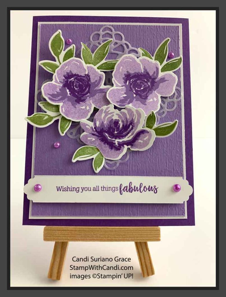
So, why is it so fabulous? Because you get all the layers of color without coloring! It’s a photopolymer, 3-step stamp set! There are 3 different stamps that make one floral image! And, you don’t need to use 3 different ink colors to get the layers. For example, In this card, I used Highland Heather stamped off once for the lightest layer, Highland Heather full strength for the middle layer, and Gorgeous Grape for the deepest layer. Don’t they look fantastic together?
Today’s Project
Let’s explore the elements of today’s card.
The card Base
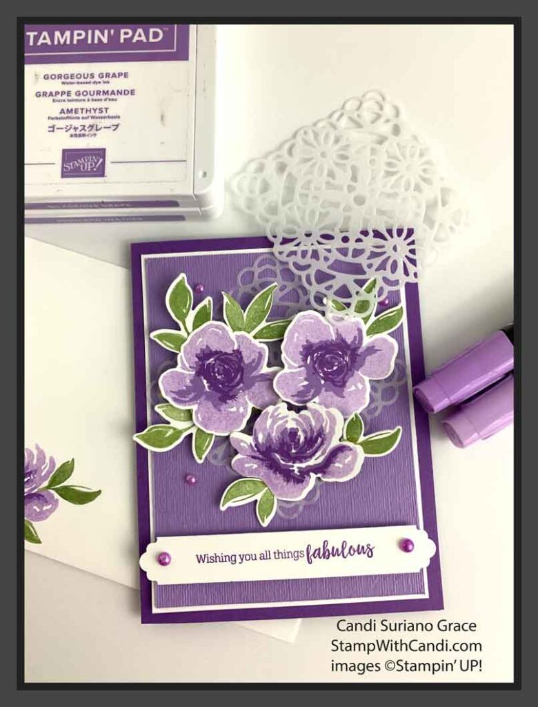
I used Gorgeous Grape as the base. Then, I used a panel of Highland Heather embossed with the Subtles embossing folder and matted with a Whisper White layer to hold the focal images. Finally, I used one of the Vellum Squares Doilies under the focal images to anchor them on the panel. They just looked weird floating around on the panel!
Stamping The IMages
There are two ways to stamp the flowers, Some people do the smallest, darkest layer first and others do the largest, lightest layer first. Usually with these kinds of stamps I go from dark to light. But, with these stamps I found it easiest to go from light to dark! I began with inking up the largest image in Highland Heather and stamping it first on scrap paper and then on Whisper White. Next, I inked up the middle image with Highland Heather and stamped it full strength on top of the first image. I found it easy to line up the the stamps by making sure the white space lined up. Finally, I inked up the top image with Gorgeous Grape and stamped it full strength on top of the previous images. So easy!
The leaves were stamped using Mossy Meadow ink. They look a little lighter than you’d expect because my pad needs re-inking. I’d better get on that before I forget. There are 3 leaf images in the set and I stamped 3 of each so that I could play around with placement. Normally, I’d use an odd number of leaves. But when I only had 5, it felt unbalanced – like there was a hole in the design. So, I went with 6. I think it works. Do you?
Cutting the Images
I used the dies included in the bundle to cut out the floral images and the leaves. However, if you like fussy cutting or have a Scan-N-Cut, you could just buy the stamp set as these images are easy to cut, especially with the Scan-N-Cut.
Designing the Sentiment
I stamped the sentiment using Gorgeous Grape ink and then used the Banners Pick a Punch punch to cut the ends. I love the versatility of this punch – two different ends and 3 different widths for each!
Don’t Forget the embellishments
I colored some large and medium sized pearls using the blunt end of the Highland Heather Dark Blends to add as accents. I could have cheated and used the new Pastel Pearls from the January-June 2021 mini catalogue that I received in my pre-order! Not sure why I didn’t except that I wanted to show how you can use the blends to make the pearls any color!
Today’s Color Palette
I have always been a fan of shades of purple. It’s just so striking. In fact, my garden has a ton of purple flowers in it. The bees seem to love it! Mossy Meadow goes so well with these shades of purple. So, it was a natural choice for the leaf color. I played around with using Garden Green or Pear Pizzazz and for some reason, they just didn’t do it for me.
Make the INside Pretty
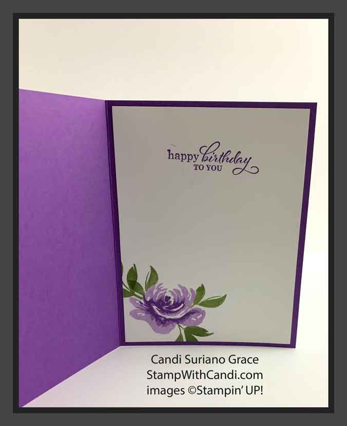
I almost always decorate the inside of my cards. I think it finishes them off so nicely. For this card, I used a panel of Whisper White on which I stamped one of the floral images and some leaves. The sentiment is from the Best Year stamp set. This is one of my favorite sentiment sets. It has a variety of sentiments for different occasions and they are in a variety of fonts that seem to fit the sentiment! I used Gorgeous Grape to stamp the sentiment. I played with using Highland Heather or Mossy Meadow and they just didn’t look good to me.
Don’t Forget the Envelope
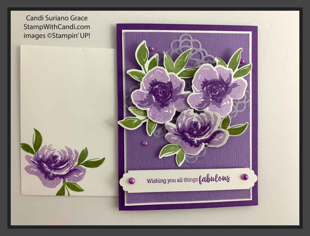
I think decorating the envelope adds a message to the recipient that there is something special inside. Usually, I use the same element on the envelope as I do inside the card which is what I did with this card. Sometimes I get more creative in one element or the other. In today’s card the inside and the envelope are almost identical.
I hope you enjoyed today’s card. If you don’t have a Stampin’ Up! demonstrator, I’d love to be yours! If you ever have any questions or need a catalog, feel free to comment or email me. And, don’t forget to Pin this post so you can find it again!
