Today the Stampin’ Up! Demonstrators in Crafty Collaborations are sharing projects that they’ve been working on for Share It Sunday. While hospitalized a few weeks ago, I had plenty of time to watch a few card-making videos. I was drawn to some that were Clean & Simple. If you’ve followed me for awhile, you know that I’m not usually a Clean & Simple card maker. But, these appealed to me. Let’s take a look.
Today’s Projects – Clean & Simple
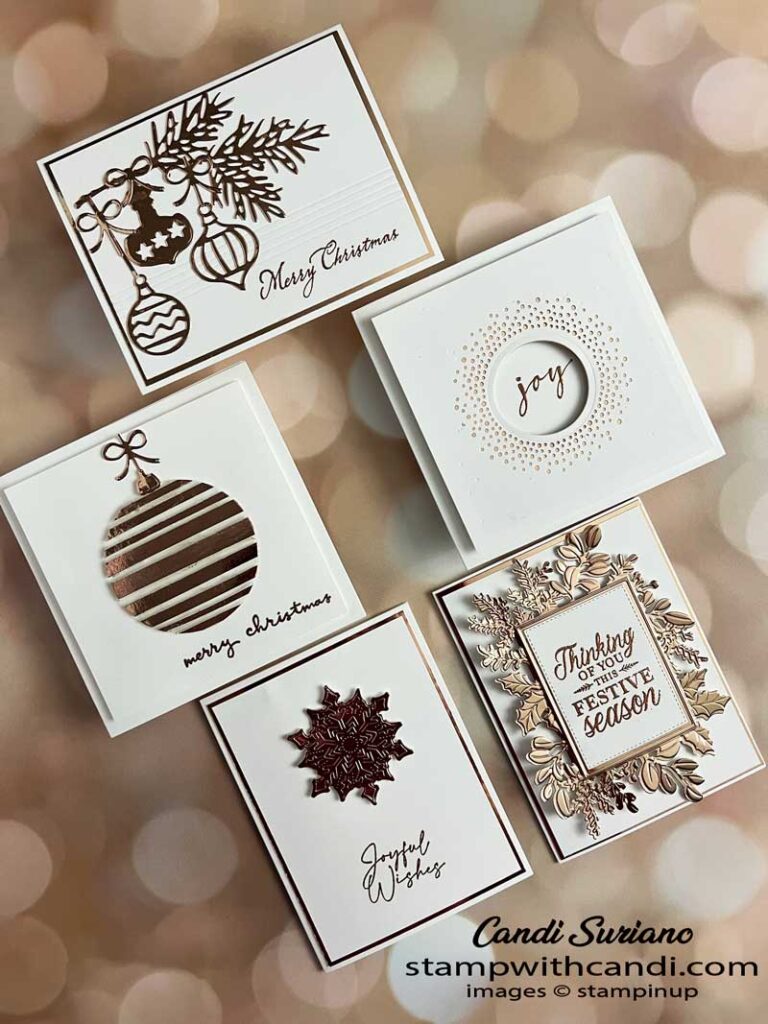
My challenge to myself was to create a set of cards using these rules:
- Only stamped sentiments
- Focal images are die cuts
- Plenty of white space
- A common layout i.e., a Thick Basic White card base, a thin metallic card layer, and a smaller Basic White layer.
- The metallic layer matches card elements, including sentiment.
I knew I wanted 3-5 cards, so I went through my dies to find suitable candidates. After choosing the dies, I then found stamps that worked with the design. The sentiment did not have to come from the stamp set that coordinated with the die, although most did.
Today’s Color Palette
As mentioned above, I knew I wanted to use metallics despite the difficulty of photographing them. Since many of the examples I cased used gold or silver, I picked copper. The annual catalog has both copper embossing powder as part of the metallics collection and copper foil.
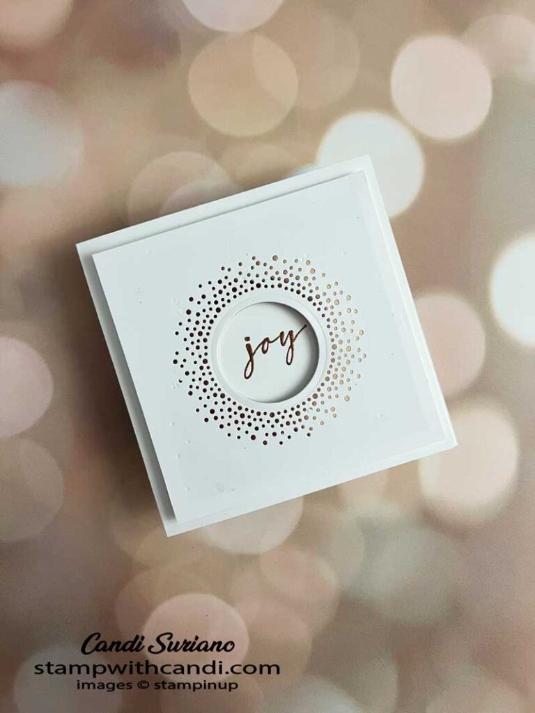
Clean & Simple – Brightest Glow
I typically don’t make square cards. They cost more to mail and Stampin’ Up! doesn’t sell square envelopes. However, this design screams for a square card! Mine is 5″ X 5″ with the top layer 4 3/4″ X 4 3/4″. The dies from the Brightest Glow Bundle do all the work on this card. This may be my personal Christmas card!
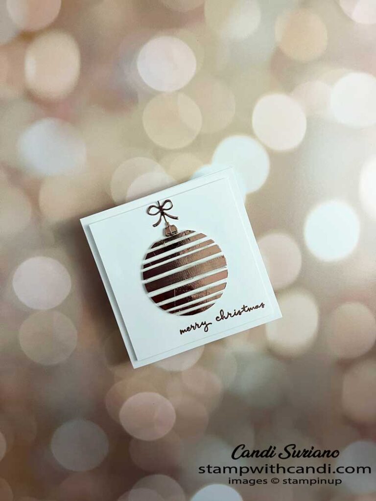
Clean & Simple – Floating Ornament
This card uses the floating technique whereby you glue strips of cardstock to a window sheet leaving some space between the strips. Die-cut it into the shape you want and then attach it to the card front using dimensionals. It looks like it’s floating on the card.
This is another square 5″ X 5″ card with a 4 1/2″ X 4 1/2″ top layer. I used the foam adhesive to attach the top layer as I wanted the extra dimension.
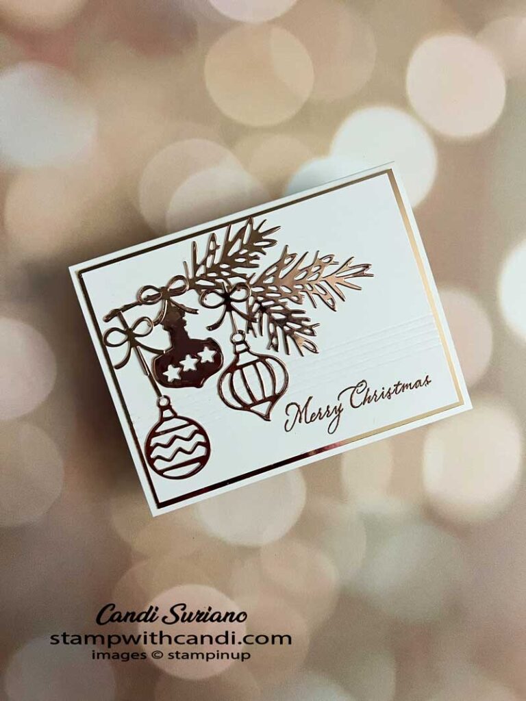
Clean & Simple – Decorated Pines
Did you notice the scoring detail on the card front? It’s a small detail but makes all the difference in this card. Tip: To save on the foil, make the die cuts from the foil layer before adhering to the card. No one is going to see them unless they take the card apart and you won’t waste a whole panel of this beautiful foil.
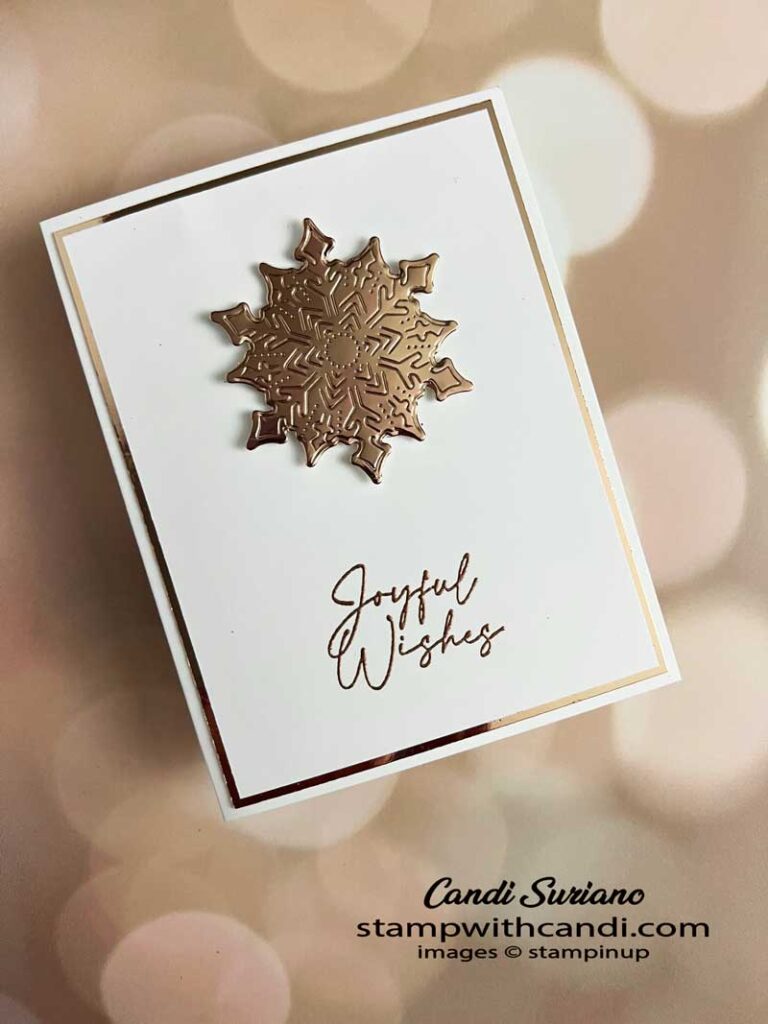
Clean & Simple – Joyful Flurries
I nested two of the Frosted Flurries dies to create the focal image on this card. I love the deeply embossed detail on this snowflake. So pretty!
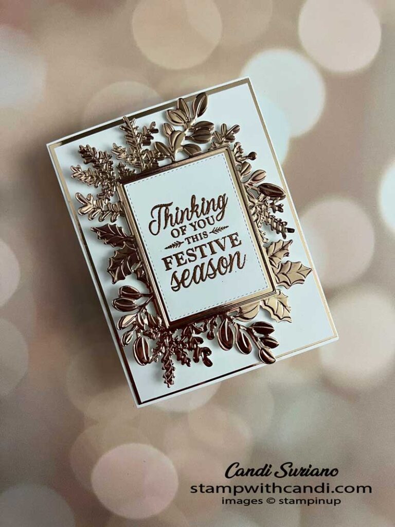
Clean & Simple – Merriest Frames
So, this card doesn’t have much white space, but I still think it fits into my challenge. I used the Merriest Frames hybrid embossing folder to both make the die cut and emboss texture onto the foil.
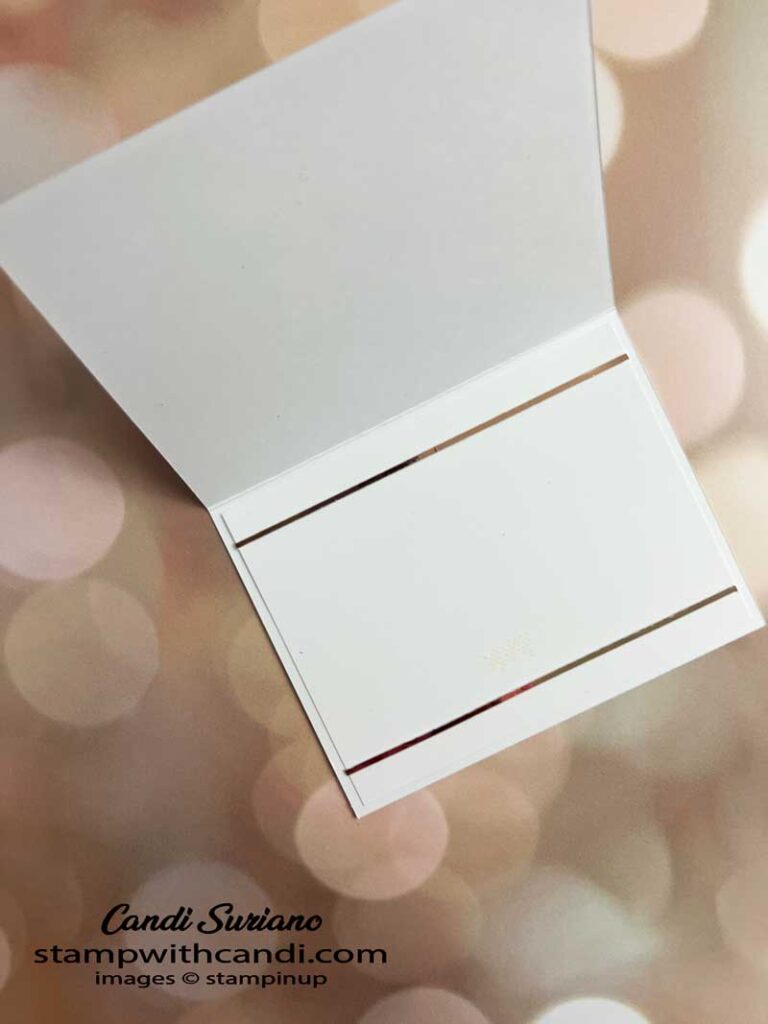
Make the Inside Pretty
The insides of the cards are all the same – two thin strips of copper foil at the top and bottom. I almost embossed the area between the edge of the liner and the copper but that would have violated my ‘rules’!
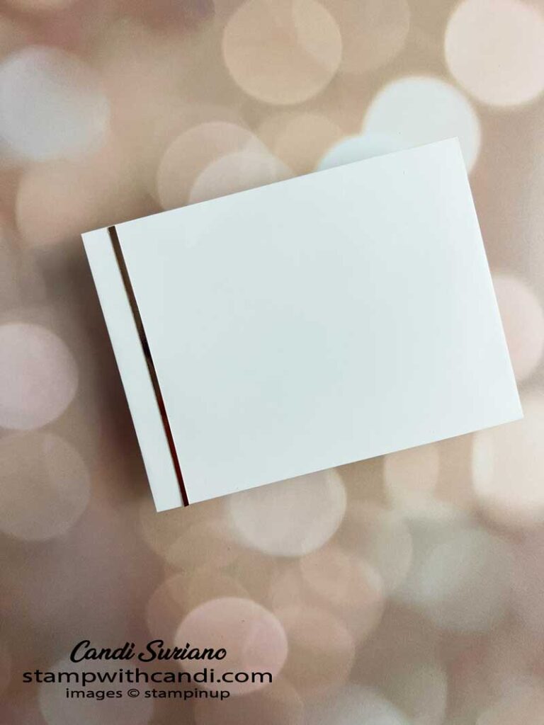
Don’t Forget the Envelope
To decorate the envelopes, I added a thin copper strip along the left side which matches the inside of the card.
I hope I inspired you to try some Clean & Simple cards following my rules. I found it quite fun to cull ideas from the supplies I had! But, not it’s time for more inspiration from my fellow Crafty Collaborators. So, grab a beverage, sit back and relax, and enjoy the hop!
Want to recreate these cards? Check out the supply list at the end of this post!








I LOVE them all. They are all beautiful!
I absolutely love all of these designs!
Great set of clean and simple cards.
What a beautiful set of cards Mandy, so classy looking x