Today’s Project – Paradise Palms
Today I’m in another blog hop with Crafty Collaborations. It’s a color challenge where we’re given some colors to work with and we use any stamp set or technique as long as the colors figure prominiently. Our colors today are Melon Mambo, Bermuda Bay, Crushed Curry, Granny Apple Green, and Basic White. Now, those are some serious summer colors! And, the Paradise Palms stamp set and dies are perfect for a summer card1
Today’s Color Palette
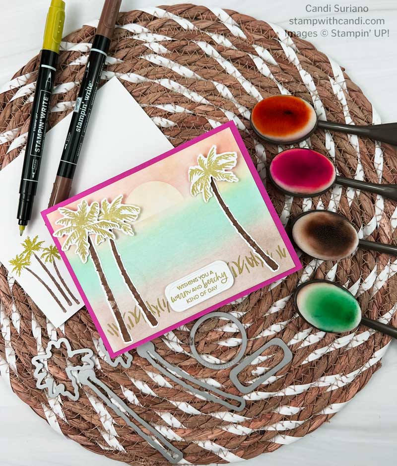
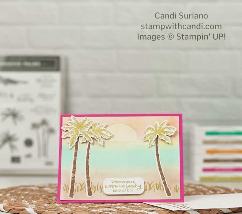
As you can see, I kept pretty much to the challenge colors. I did throw in some Crumb Cake for the sand on the beach. And, although the sun is Crushed Curry, it’s blended so lightly that you might not notice it The sky also is a blend of Crushed Curry and Melon Mambo to give a sunset field.
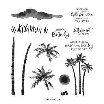
Today’s Stamp Set – Paradise Palms
I just love the elements in this set. The palm trees in different sizes and scales make it work with a lot of different scenes. But, I think my favorite part of the set is the sentiments. I love the fonts and the words. I initially bought the set because of the Retirment Wishes sentiment. I’m at the age where there are a lot of retirments in my life, so that stamp is getting a lot of use. And the one I used on this card is just so perfect for summer – Wishing you a warm and beachy kind of day. Don’t you just love it???
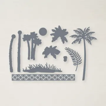
Today’s Dies – Palms Dies
The dies have some fun elements, too. Besides cutting out the palms from the stamp set, you can add coconuts to the tree and grass to the beach and a cool fence detail that makes a great border for other cards. I just love when a die set can be used independently of the stamps! It makes it so much more versatile and worth the money!
You Can Make It, Too!
Card Base and Initial Layer
I started with a Melon Mambo card base cut at 5 1/2″ X 8 1/2″ and scored at 4 1/4″. Check off one color.
Next I used blending brushes to make the sky, water, and beach. The beach was blended using Crumb Cake ink which was not a color in the challenge. The water was blended using Bermuda Bay ink. Check off the second color.
For they sky, I started with Crushed Curry base. Check off the third color. Then I cut a Layering Circles die from the new Masking Papers.Since I was looking for a sunset effect, I cut off the bottom of the circle and then adhered it to the sky. Finally, I blended on some Melon Mambo very lightly to give the pinky tone to the sky. Check off the fourth color. After peeling off the mask, we have a yellow sun in a pinky yellow sky. You can see other examples where I used the masking papers in this post and this post.
Creating the Scene – Paradise Palms
First, I stamped the grass image from the Paradise Palms Stamp Set using Granny Apple Green ink onto the Crumb Cake beach. Check off the last color. The Granny Apple Green leaves were stamped off once to make them a little lighter since the base scene was somewhat pastelly. In fact, the colors in the card look much more subuded than you’d think for these usuall vibrant colors.
Then I stamped the tree turnks using Soft Suede ink on a Basic White scrap and the palm leaves using Granny Apple Green ink on the same scrap. After cutting them with the dies, I attached them to the card using liquid glue for the trunks and dimensionals for the leaves.
I considered adding a boat or some birds to the scene, but decided that it was didn’t need anything more. What do you think?
Time for the Sentiment
This was easy because I’d used this sentiment before and I knew it fit perfectly in the die cut from the Beautiful Shapes die. After stamping the sentiment in Granny Apple Green and die cutting it I adhered it to the front using two dimensionals. I love this die because it has the irregular embossing which makes it a little different than the other dies we have.
Make the Inside Pretty
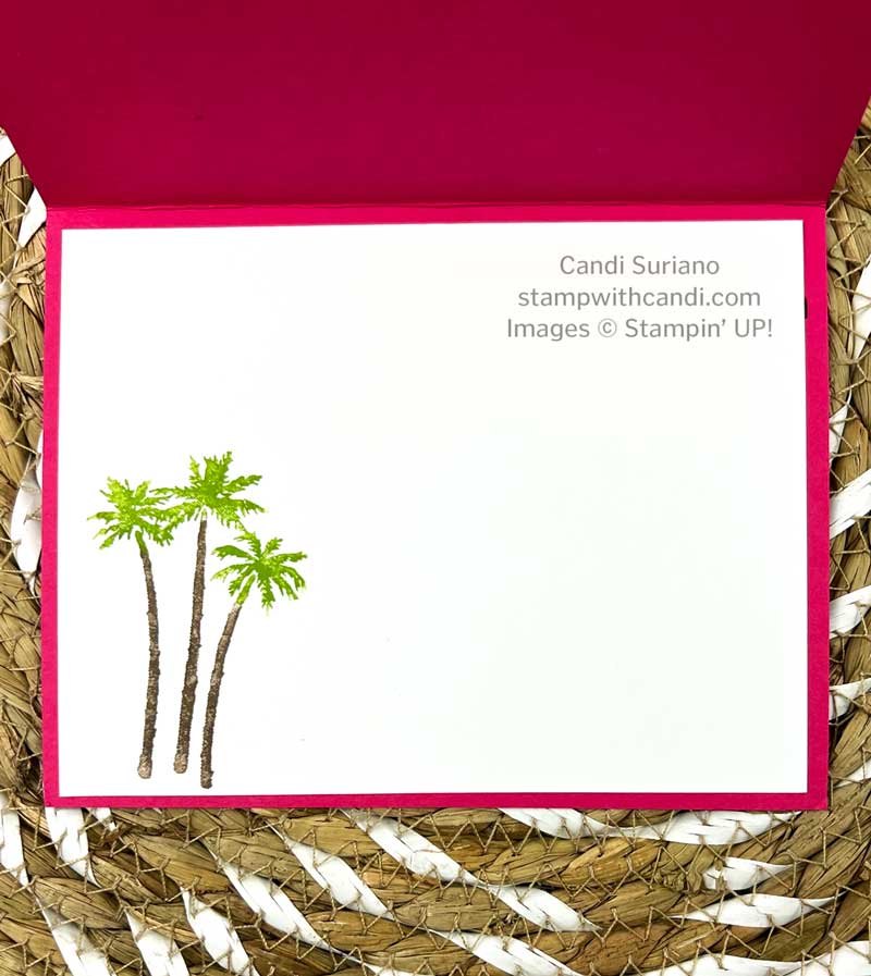
For the inside, I colored the tree runks using a Soft Suede Stampin Write Marker and a Granny Apple Green Stampin Write Marker on the leaves. Huff on it a couple of times to moisten the ink and stamp. After stamping the trees on the Basic White panel, I used Stampin’ Seal to adhere it to the card base.
Don’t Forget the Envelope
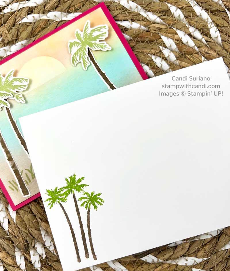
I used the same design element on the envelope as I did on the inside. Soft Suede marker on the trunks and Granny Apple Green on the leaves. This ink to stamp method is also good for beginner stampers as they can buy a set of markers in a color family for a lot less than buying a set of stamp pads!
I hope you enjoyed today’s project as much as I did making it and it inspires you to use this same color combination. But, now it’s time to grab a beverage, sit back and relax, and enjoy the hop. I’m sure you’ll see many awesome examples of today’s color palette.
It’s Summer Sale-a-bration! For every $50 you spend, you can select an item from the Summer Sale-a-bration catalog. Who doesn’t like free??? Click on the image above to see what’s available and start planning your order. Need some suggestions? Let me know and I’ll help you get the most for your money!






Nice job blending! Great card.